The Origin of “The Ode to Color” Collection
The idea of this collection was born on a gloomy day. I was walking down the street and noticed the way spots of color around me changed my mood and my perception of the world. Then I started thinking about how colors affect our lives. After all, it’s part of nature — green grass, vibrant shades of flowers, and the endless blueness of the sky.
Color draws attention. It’s something that stands out without saying a word. I started recalling my childhood love for bright things.
We would use colorful pens to answer “What’s your favorite color?” in our school slam books. We would choose the boldest pencil colors and didn’t even think about whether they matched. You might think that only artists allow themselves the right to use color as adults. Grey, restrained, and inconspicuous win in daily life and become a part of our waking routine.
We wanted to use the widest possible color scheme in this collection — to break boundaries, make it bold and unexpected. The mix of colors is loud, defiant, but coordinated. They brighten up sleek silhouettes, add confidence and boldness, inspire, and help express personality.

About Clothes
We looked for inspiration in many fields, such as various objects of applied arts and craft, Ukrainian painting, craftsmanship, and a plain fondness for a specific color. This pull didn’t need any justification — we trusted our feelings.
The biggest influence for the items was the artwork of Ukrainian artists of XX century: Sonia Delaunay, Zoya Lerman, Mariya Pryimachenko, Oleksandra Exter, Yevhen Pshechenko, and Andriy Kotska. They worked with color boldly, instinctively, and expressively.
Another source of inspiration was vintage United Colors of Benetton and Kenzo advertising campaigns. They combined people of different races, personalities, and types.
These shots appear as visual manifestos of freedom, courage, and play.


What This Collection Is About
About the courage and happiness of being visible. About the game of self and society. Because when you wear color — you make a choice, proclaiming, “I want to be visible.” And it’s not always easy. But always authentic.
It’s also about openness. About the way each person can match these clothes with their style, mood, and inner self. It’s important for us not to push our vision on anyone, but to create space for expressing individuality.

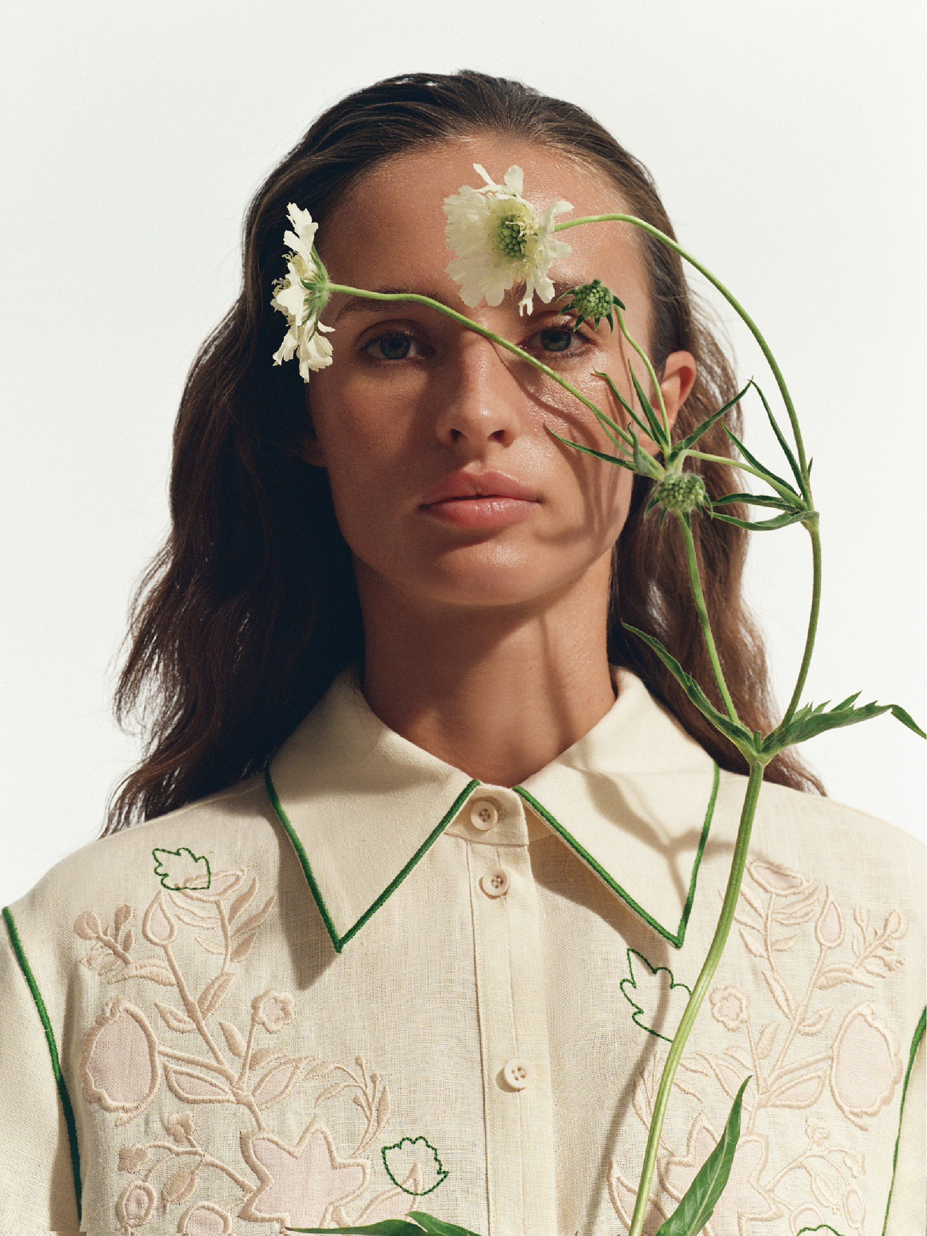
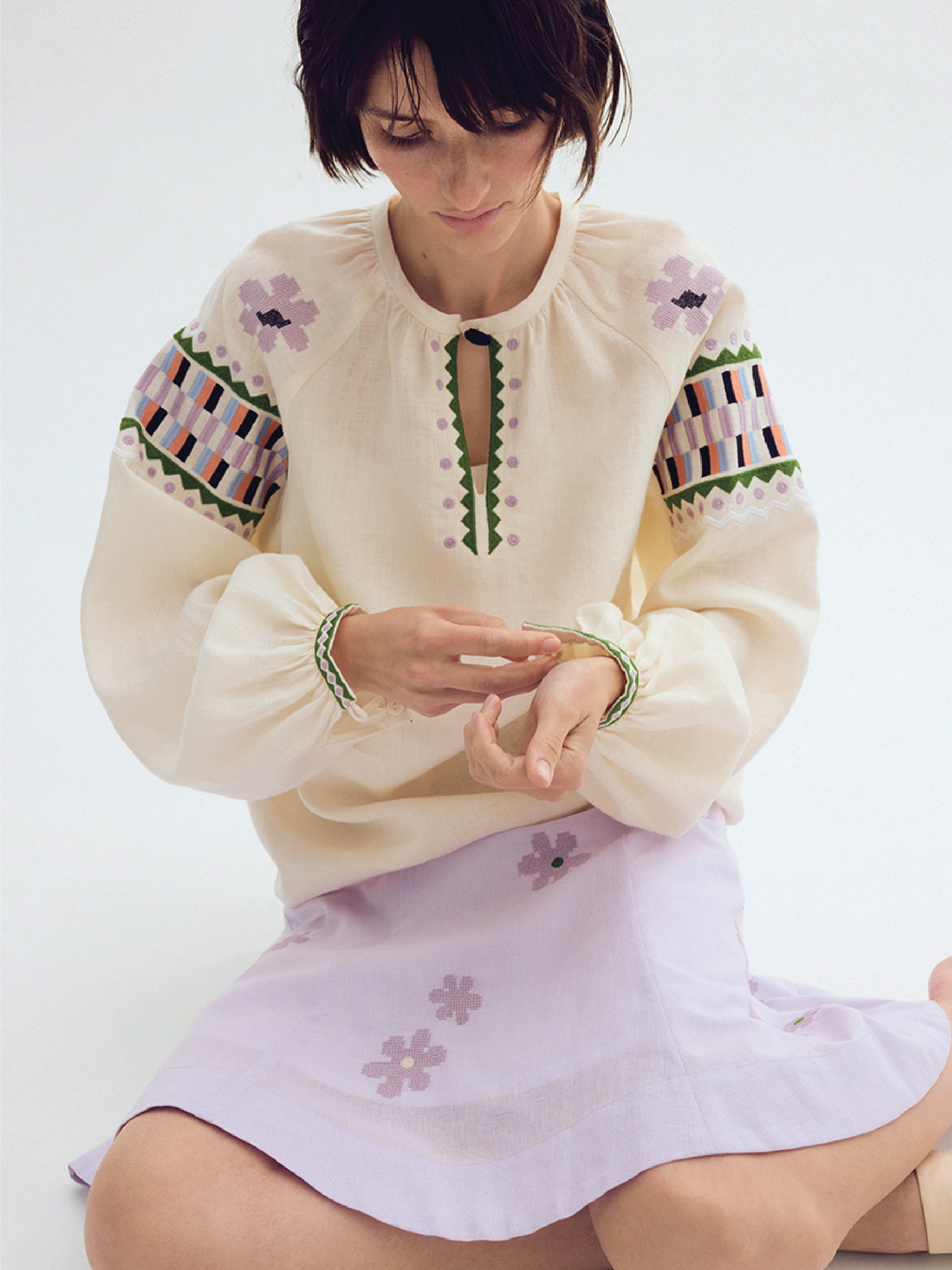
It's about things
We experimented with materials. In addition to our signature linen, this time we used dense cotton in a bright blue color and soft tencel in sandy and cobalt shades.


Go to the collection
Archival materials:
- Kulchytska Olena, "Above the Adriatic," 1911
- Kotska Andriy, "Bride" 1967
- "Wall Paper Decorations of Kamianets Region," Hagenmeister V., 1930
- Pavlovskyi Mykhailo, "Bottles 'Blue'," 1968
- Dzindra Mykhailo, "Bent Form on Base"
- Kulchytska Olena, "Portrait of My Sister in Blue," 1919
- Fragment of velvet skirt from the village of Trubaytsi, Kharkiv region, early 20th century. Velvet, silk ribbon, stitching, applique. Ethnographic collection "Drevo"
- House painting along the eaves. 1920-1921, village Kozache, Kyiv region. Sketch by M. Pohrebinets
- Exter Oleksandra, "Women's Costume for Spanish Dance," 1920
- Cover of the book "Ornament of Ukrainian Block Prints." Architecture Publishing House of the Ukrainian SSR, Kyiv, 1950
- Exter Oleksandra, "Woman with Fish," 1932-1934
These are the thoughts shared by Mariya Pavluchenko, Etnodim’s creative director.